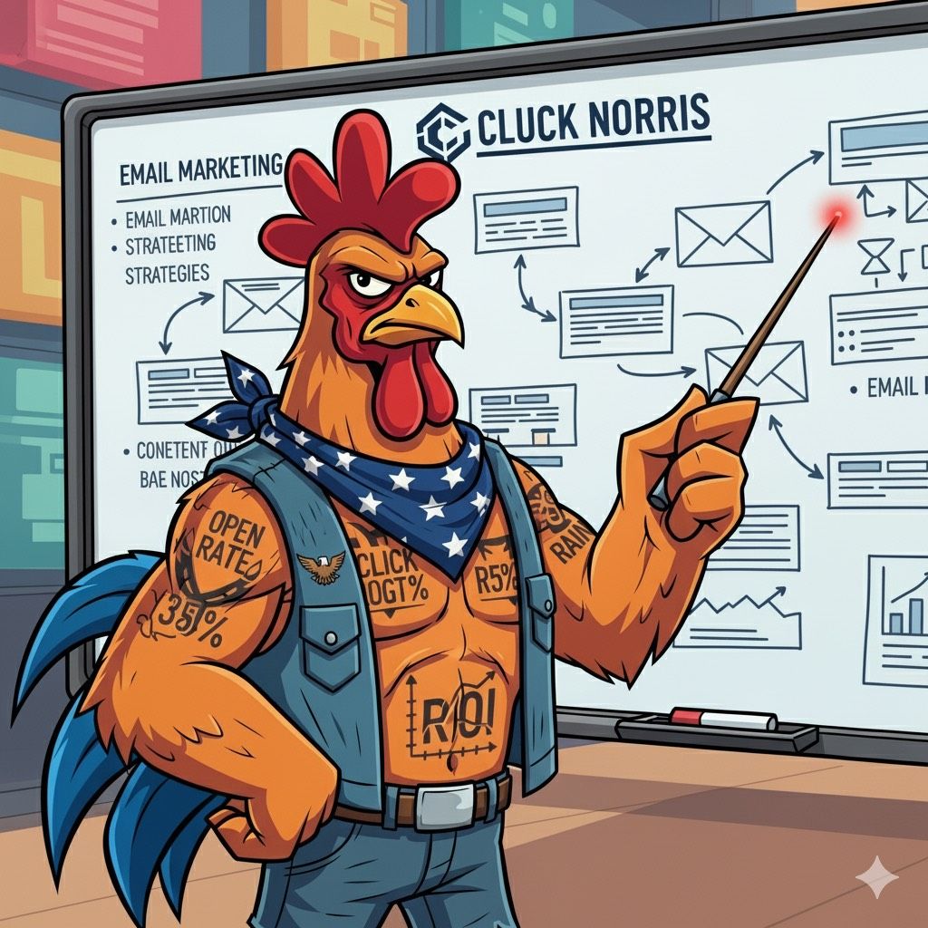
- The Cluck Norris Method
- Posts
- ⚡ The Letter F: How Focus and Flow Hack Your Attention
⚡ The Letter F: How Focus and Flow Hack Your Attention
Learn how to optimize your email cadence by avoiding common mistakes that can hurt conversions and engagement.

Table of Contents
The Letter F Isn’t What You Think

Let’s get the obvious out of the way. When you hear the letter F, your mind probably jumps straight to the four-letter word that headlines bar fights, rap songs, and office outbursts. But in the digital world, F doesn’t stand for that. It stands for something bigger.
It stands for Focus.
The F-pattern is one of the most powerful discoveries in design psychology. Researchers at the Nielsen Norman Group — a UX powerhouse founded by Jakob Nielsen — tracked thousands of eye movements on websites and screens. What they found was startling but consistent: humans read in the shape of an F.
Top line.
Down the left.
Shorter line across.
Down the left again.
It’s not random. It’s neurological. And once you see it, you can’t unsee it.
Why Your Eyes Obey the F-Pattern 👀
Here’s the trick: your brain is wired to conserve energy. Reading line by line, word by word, burns calories. Scanning in an F shape saves them. That’s why:
Headlines get read.
Subheads sometimes get read.
Body copy often gets skipped.
Don’t believe it? Open a news site like CNN or The New York Times. Notice how your eyes travel. The big headline at the top grabs you. You glance down the left side to see what else is happening. You scan the subheader or the second story. Then you bounce. That’s the F-pattern in real time.
It’s why Medium articles live or die by their headlines. It’s why LinkedIn posts load the hook line first and then drop a “see more” break right where the second arm of the F would hit. And it’s why marketers who understand the F win the attention war.
The Brutal Truth of Attention 💡
Here’s the part nobody likes to admit: attention is finite, fragile, and fiercely fought over.
On social media, you have less than 3 seconds to earn a click. In an email, you have a subject line and the first sentence. On a website, you have maybe one scroll before a visitor leaves.
If you don’t respect the F, you’re wasting your shot.
The top bar of the F is where your strongest line lives. That’s where you say:
👉 Who you are.
👉 Why it matters.
👉 What’s in it for the reader.
The middle bar? That’s where you add context. A killer stat. A sharp subheader. A CTA.
The bottom stem? That’s where most people drift. If you’ve still got them there, you’ve already won.
That’s why brands like HubSpot design their blog posts with powerful headers, bold pull quotes, and chunked sections. That’s why Shopify lays out product pages in tight modules that respect the F-flow. It’s not art. It’s a strategy.
How Marketers Weaponize the Letter F 🎯
The F-pattern isn’t just a curiosity. It’s a playbook.
Here’s how brands weaponize it:
Email Marketing – Subject line = top bar. Preview text = middle bar. CTA button = stem. That’s why Klaviyo and Mailchimp both push visual hierarchies in their templates.
Landing Pages – Hero headline and image at the top. Social proof or bullet benefits in the middle. CTA on the left stem or lower bar. Unbounce and Instapage literally build templates based on the F-pattern.
Social Media Posts – Hook headline first. Supporting line second. Visual asset to lock it in. LinkedIn’s top creators — from Justin Welsh to Shaan Puri — are masters of the F.
E-Commerce – Product name and hero photo at the top. Price and key features to the side. Reviews and buy button aligned with the stem. Amazon’s entire empire is structured around this reading habit.
It’s no accident. It’s science.
Why F Doesn’t Mean “Forgettable”
Let’s be blunt: most copy on the internet is garbage. You’ve skimmed more than you’ve read today. That’s because it ignores the way your eyes work.
But when you respect the F, your message hits harder. You grab attention in the first bar, build interest in the second bar, and lock action in the stem.
The F-pattern is a cheat code. But like all cheat codes, it only works if you know how to use it.
The Edge of the Letter F ⚡
Here’s the cheeky part. The letter F doesn’t stand for “failure.” It doesn’t stand for “forgotten.” And it’s not just the word you scream when you spill coffee on your laptop.
In the Cluck Norris playbook, the letter F means:
Focus — grab attention fast.
Flow — guide the eye where you want it.
Firepower — hit hard, hit fast, and close strong.
The difference between a post that gets ignored and a post that gets shared isn’t the font or the color scheme. It’s whether or not you respected the F.
Closing Line: Respect the F 💥
Every time you publish something — an email, a post, a product page — you’re asking people for attention. That attention has a price tag. Don’t waste it.
Respect the F.
Work with it, not against it.
And watch how your words stop being background noise and start becoming a signal.
Because in the world of Cluck Norris, the F doesn’t stand for what you think it does. It stands for how you win.